
Full brand and packaging build for a fruit-drink label — logo, bottle label artwork across three flavours, and a run of social media posts designed to make every flavour feel as juicy on screen as it does in hand.
A clean botanical wordmark that carries across every bottle, post and catalogue — simple enough to shrink onto a label, bold enough to lead a campaign.
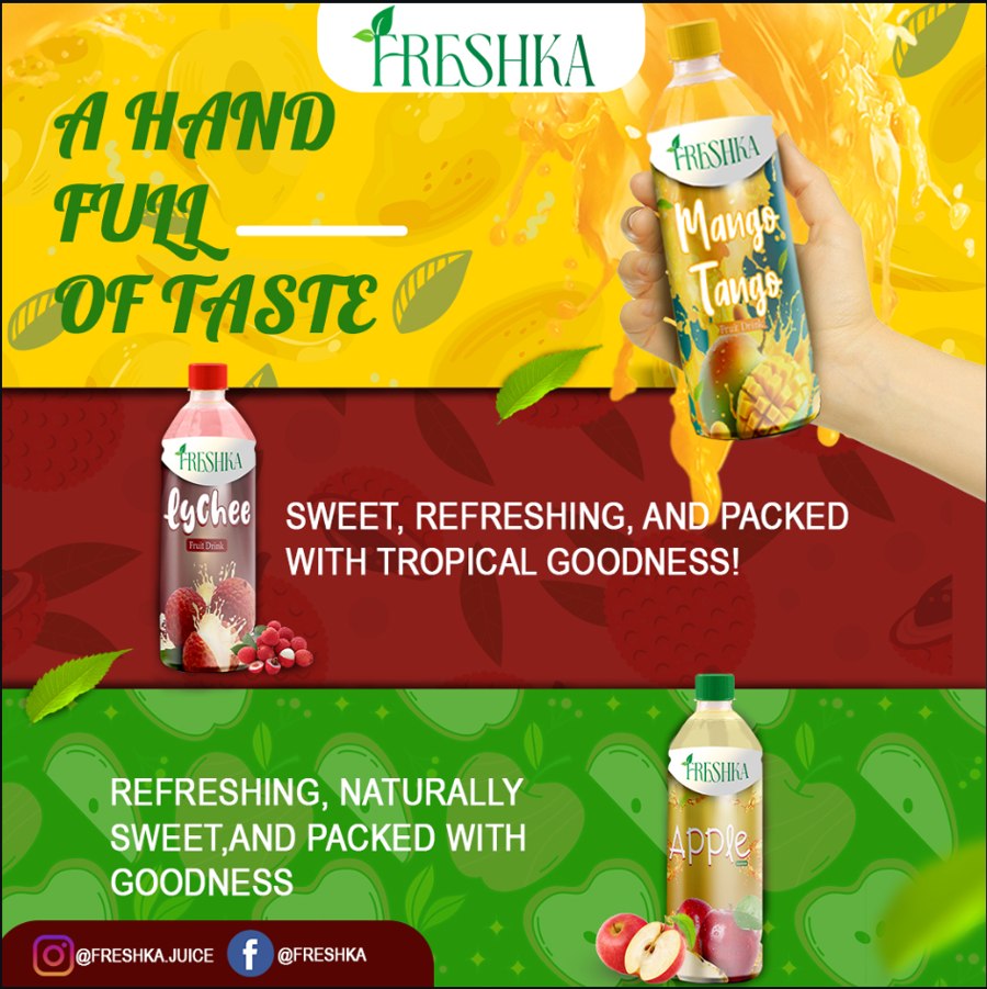
Each flavour got its own colour mood and mini-story — green for Apple, sunset orange for Mango Tango, deep red for Lychee — while staying instantly recognisable as one family.
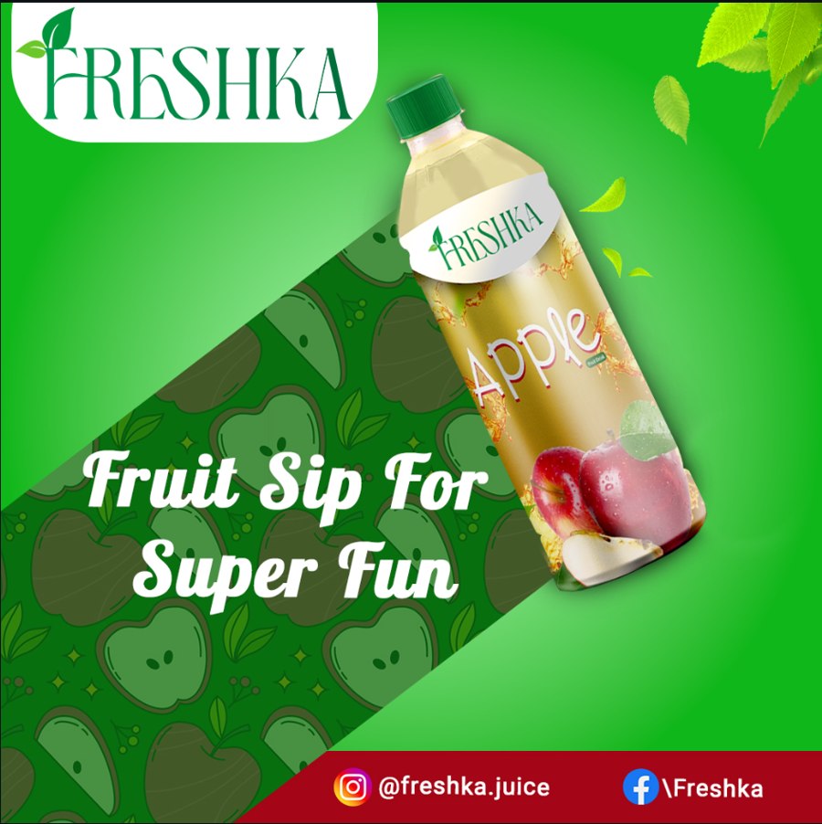
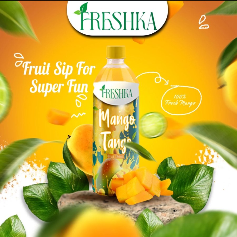
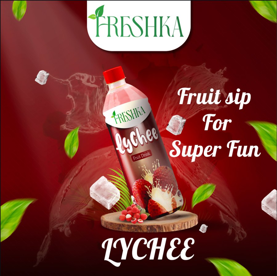
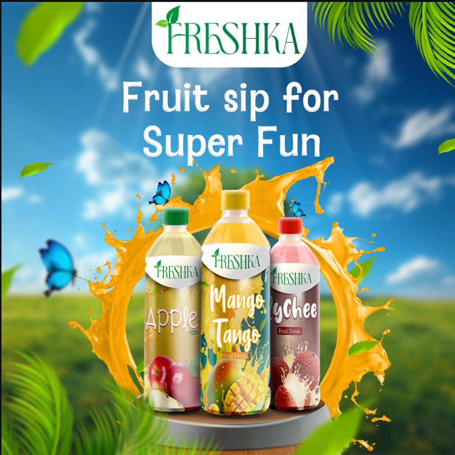
A flavour catalogue post pairing each bottle with its own line, plus a hero group shot bringing all three flavours together for the brand's main feed post.
Logo, packaging and scroll-stopping social content — all handled by one team.